New: Try our free Website Audit tool. Run your free audit →Run it free →

Dentists & dental practices

Websites that turn putting it off into a booked appointment.

Central Systems builds premium websites for NHS and private dental practices. Sites that answer the three things a patient will never ring up and ask — how bad is this, what will it cost me, and will it hurt — so the appointment gets made instead of postponed again. New builds, and rebuilds of sites that look perfectly nice and book almost nobody.

In-pain triageNHS or privateNervous patientsLocal search
A dentist holding a tablet showing an x-ray, turning the screen towards the patient sitting beside her so they can both look at it.

What the enquiry form never hears

Three questions people are too embarrassed to ask on the phone.

Every practice knows them, because every nervous patient eventually admits them from the chair. Almost no dental website answers any of them above the fold, which is why so much traffic reads the page and rings nobody.

  1. 01

    “Is this bad enough to bother someone about?”

    Something has broken, or throbbed for two nights. They are weighing a real symptom against the fear of wasting your time, and they will search before they dial.

    What the site owes them: a plain answer about what the symptom usually means and how quickly it needs looking at — including the times the honest answer is “this can wait”.

  2. 02

    “What is this actually going to cost me?”

    NHS and private sit side by side in the same building on different rules, and most people have no idea which they are entitled to. Silence on price does not read as discretion. It reads as bad news.

    What the site owes them: the national entitlements stated as national entitlements, the practice’s own fees stated as the practice’s, and a clear line between the two.

  3. 03

    “Will you judge me, and will it hurt?”

    The patient who has avoided a dentist for nine years is not comparing practices on price. They are looking for permission to walk in, and one wrong sentence sends them away for another year.

    What the site owes them: somewhere to say they are frightened before they arrive, and evidence that saying so changes the appointment they get.

The first question

Triage belongs on the page, not in the voicemail.

Dental pain does not keep office hours. Somebody who has chipped a tooth at the weekend is going to read something before Monday, and if it is not your page it will be a forum. Answering properly is also the fastest filter you have: it tells the genuine emergency to ring now, and tells the chipped-and-comfortable to book normally.

  • 01
    Sort by symptom, not by treatment nameNobody searches for “avulsed incisor”. They search for a tooth knocked out, a swollen face, a filling that fell into their dinner.
  • 02
    Say what to do in the next ten minutesKeep the tooth in milk. Bite on a gauze pad and leave it alone. Small instructions, written with you, that genuinely change the outcome.
  • 03
    Name the line that is not yoursOut of hours in Scotland that is NHS 24 on 111, and a facial swelling affecting breathing is 999. A practice willing to point somebody at a service that is not its own reads as one worth trusting with everything else.
  • 04
    One tap to the phoneA person in pain does not complete six form fields. On a handset the number is a button, and it is above everything else.
Interface by Central Systems
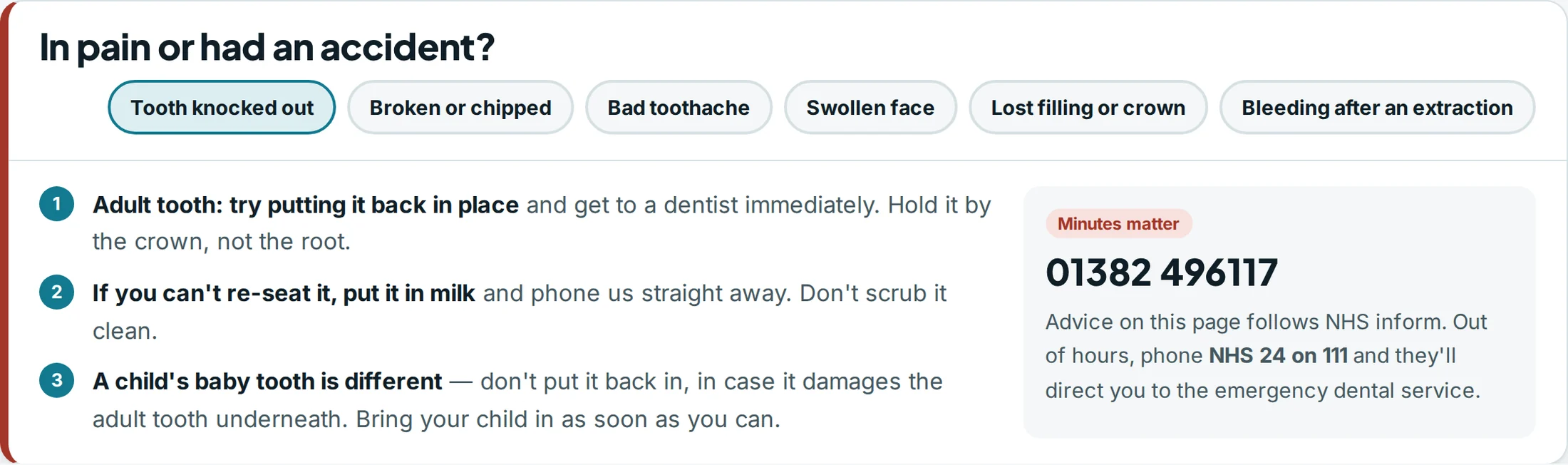
In pain or had an accident?
An urgent-care panel designed by Central Systems. Six symptoms run across the top, from a tooth knocked out to bleeding after an extraction; choosing one opens three numbered first-aid steps beside a panel giving the practice number and directing out-of-hours callers to NHS 24 on 111.

Your words, checked with you. We draft the triage copy against NHS inform and then sit with the clinical lead until every line is one the practice is happy to stand behind. It is written so it never implies a symptom is safe.

The second question

Most patients do not know what they are entitled to.

In Scotland an examination is free for everyone and under-26s pay nothing for NHS care at all — and a surprising number of people who qualify have no idea. A page that explains the national rules before it quotes a private fee earns the right to quote the private fee.

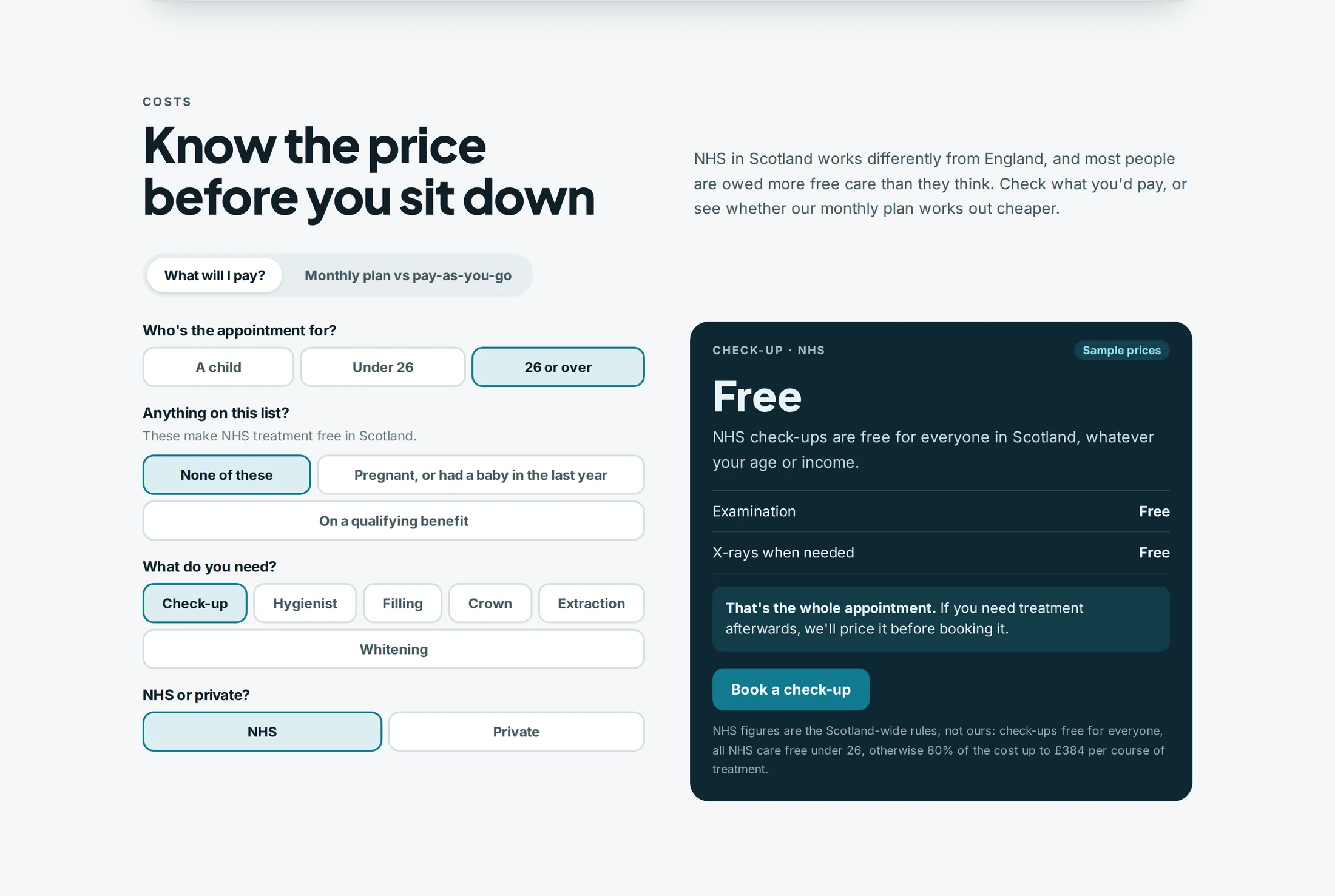
Costs — desktop
A pricing section of a dental website designed by Central Systems, headed know the price before you sit down. Four questions about age, exemptions, treatment and NHS or private produce an answer panel headed Free, explaining that NHS check-ups are free for everyone in Scotland, with a sample-prices label and a footnote attributing the figures to the Scotland-wide rules.

National rules and practice fees, kept visibly apart. The entitlements are quoted as national rules and labelled as such in the design; every private figure is the practice’s own and is labelled as a sample where one is shown. Fee tables are built to be updated by your team in minutes, because a stale price list is worse than none.

The third question

Ask how they feel about dentists, then act on the answer.

Dental anxiety is the single biggest reason a person who needs treatment does not have it. A booking form that asks the question is easy. A practice that changes the appointment because of the answer is the thing worth building, and the thing worth saying on the page.

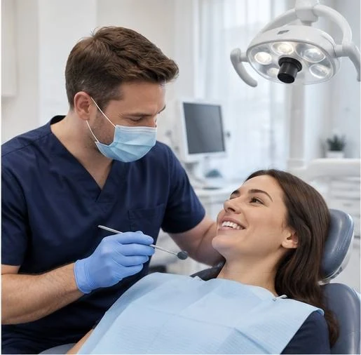
A dentist sitting level with a patient in the chair, both of them talking rather than working, with the instruments out of shot.
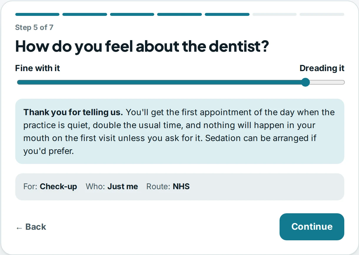
Booking — step 5 of 7
A booking step designed by Central Systems, headed how do you feel about the dentist, with a slider running from fine with it to dreading it. The slider is set near the anxious end and the panel below promises the first appointment of the day, double the usual time, and that nothing will happen at the first visit unless the patient asks.

The promise has to be real before it goes on the page. Longer slot, quiet time of day, a signal that stops everything — whatever your team genuinely does. We will not write a reassurance your diary cannot keep.

The finished site

Three answers, one homepage, in the order they are needed.

Help first, because the person in pain cannot wait for your practice history. Money second. A way in third, built so that admitting you are frightened is the easiest thing on the form. Nothing buried under a menu called Patient Information.

Homepage — desktop
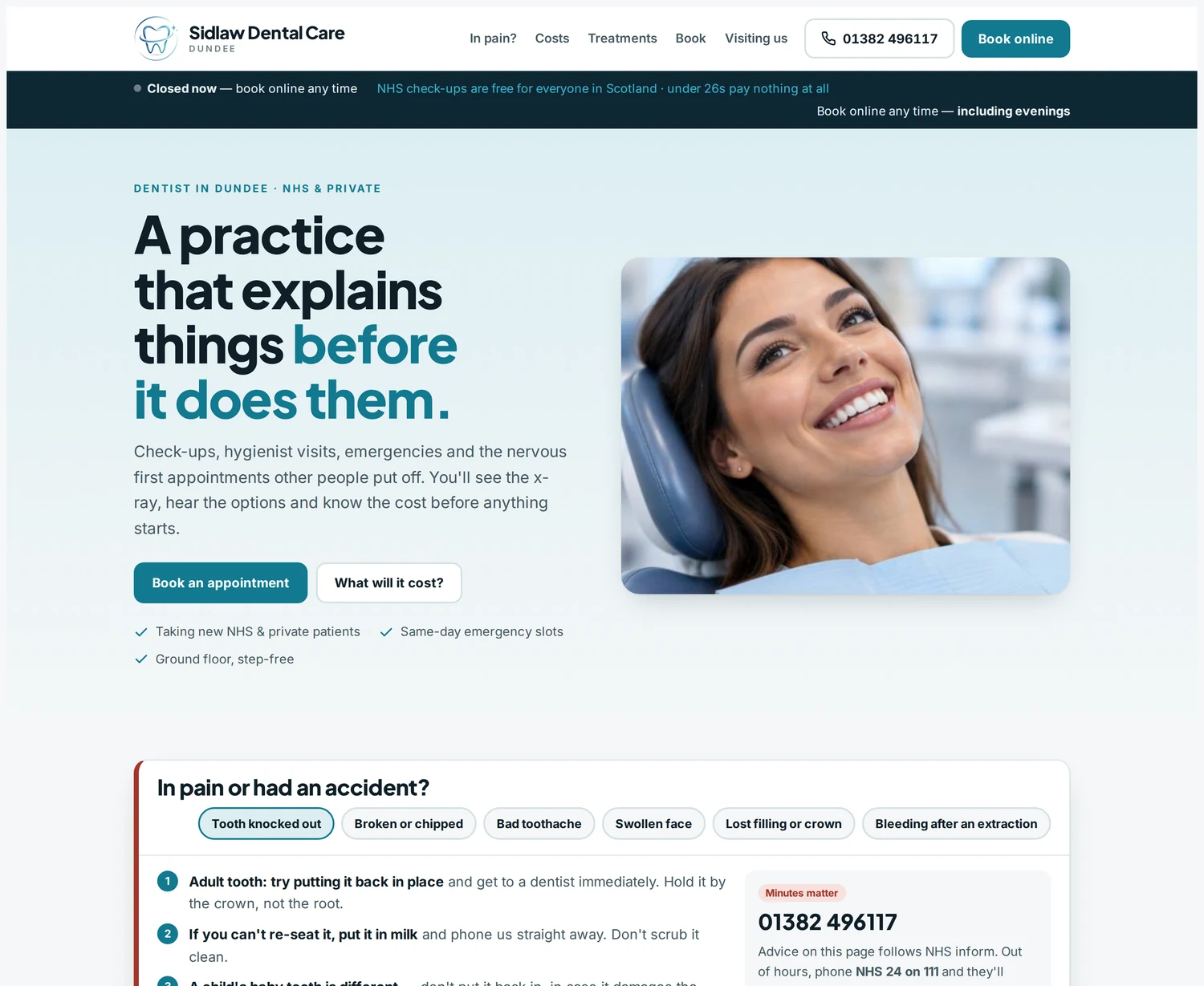
The homepage of a dental practice website designed by Central Systems. A pale header carries the practice name, five navigation links, a phone number and a book-online button, above a strip noting that NHS check-ups are free for everyone in Scotland. The hero reads a practice that explains things before it does them, beside a photograph of a patient smiling in the chair, and the in-pain panel begins underneath.
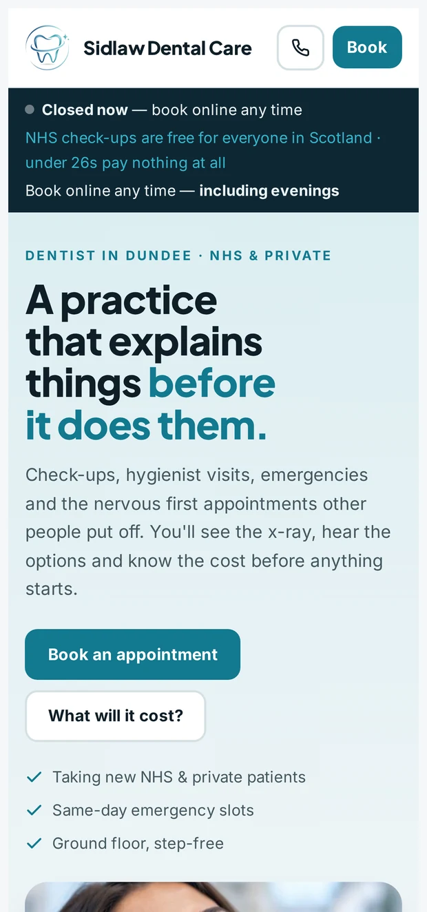
The same homepage on a phone. The header collapses to the practice name, a call button and a price button; the headline, the two buttons and the reassurance list stack in one readable column.

Sidlaw Dental Care is our own practice, not a client’s. We designed and built it here so the three routes could be shown working together on one page rather than described. Where a real practice would show its patient reviews, this design shows none at all. Writing fake ones to decorate a demonstration would contradict the section directly above it.

Regulated words

Dentistry is the one sector where good copywriting can get you in trouble.

Your website is advertising, and dental advertising answers to the General Dental Council and to the advertising codes. Most of the phrases a marketing agency reaches for first are exactly the ones that cause a practice a problem later.

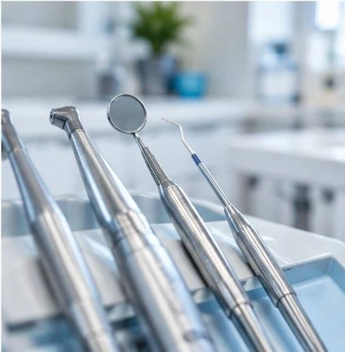
Sterilised dental instruments laid out on a tray, photographed close in shallow focus.
  • Registration goes on, unverified letters do not. Registrant names and GDC numbers where the rules expect them. Nothing is written onto your site that your team has not confirmed it holds.
  • No outcome is promised. Not how it will feel, not how long it will last, not that it will work. We describe what actually happens at the appointment instead, which is more persuasive anyway.
  • Before-and-after images are treated as evidence. Genuine, consented, representative, and captioned honestly — or left out. They are not decoration.
  • Whitening is written as dentistry. It is restricted by law to dental professionals, so the page positions it as a clinical treatment rather than a beauty offer, and never in a way that invites a comparison with a salon.
  • NHS and private never blur. Which route a treatment sits on is stated plainly on the page it appears on, because a patient who feels quietly moved from one to the other does not come back.

None of this costs you enquiries. The practices that write carefully read as the ones who will also explain things properly in the chair.

Being found

“Dentist near me” and “implants” are two completely different jobs.

One is proximity and opening hours and a map pin, decided in seconds. The other is a considered purchase worth several thousand pounds that somebody researches for weeks, comparing three practices and reading every page you have. Most dental sites are built for the first and hope it covers the second.

Fast

The registration search

New to the area, needs a dentist, wants to know whether you are taking patients and on which route. Won or lost on load speed, a phone number that taps, accurate hours and an honest answer about your NHS list.

Slow

The treatment search

Implants, orthodontics, a full smile rebuild. These need a page each — what the treatment involves, how long it takes, what it costs, who carries it out and what the alternatives are — not a line on a services list.

Clear, structured, genuinely useful treatment pages are also what helps a search engine, and increasingly an AI assistant, understand what your practice does. That is the mechanism. Nobody can promise you a ranking or a citation, and you should be wary of anyone who does.

If you already have a site

You probably need a rebuild, not a redesign.

Most practice websites are not ugly. They are simply built around the practice — our team, our history, our values — when the visitor arrived with a symptom, a budget worry or a fear. Rearranging that content prettier does not fix it.

Keep what already ranks

Pages that have earned their position stay at their addresses, or move behind proper redirects. Nothing that works is thrown away for the sake of a new build.

Cut the admin, not the care

Online booking, recall reminders, forms completed before arrival rather than on a clipboard in the waiting room. Less time at reception retyping what a patient already told you.

Build only where the software stops

Your practice-management system should stay where it is. We build around the gaps it leaves rather than proposing to replace something clinical and working.

Questions

What dental practices ask us

We are mostly NHS. Is this worth it?

Yes, though the goal is different. An NHS-heavy practice usually wants fewer failed appointments, less phone time and a clearer route for the private treatments it does offer — not a flood of new enquiries it cannot see.

Who writes the clinical wording?

We draft it, your clinical lead corrects it, and nothing goes live until they are happy. We are website people, not clinicians, and the page should sound like the practice rather than like us.

Can you work with our practice-management system?

Usually alongside it rather than into it. If a real integration exists, we use it. If none does, you hear that at the quote stage rather than halfway through the build.

How long does a practice website take?

Typically six to ten weeks from first conversation to launch, and the clinical review of the copy is usually the part that sets the pace. We will give you a date and keep you posted against it.

Do you do the photography?

We arrange it. Real rooms, real team, real equipment — a practice is a place people are nervous about walking into, and showing it genuinely does more work than any stock photograph.

What if we have several sites or a group?

One system, one set of components, a page per practice with its own hours, team and route. Group sites fail when every location becomes a copy of the first with the town name swapped.

Let’s answer the questions your patients are not asking.

Tell us how the practice runs and what you want more of, and we will show you what a site built around the three worries would look like for you.